Wednesday 28 October 2015

Quality of line

The next task we were given within Visual Language was to explore line quality. This was because it serves as the foundation to al drawing and there fore can be seen as drawing in its 'purist' form. Further more the varying quality of line, how you see it, apply it, choose to create and alter it can fundamentally change an image and how it is being described visually. Furthermore there is no right or wrong way to view quality of line due to the unending possibilities it poses.

The work of Ben Shahn when considered next to Sam Vanallemeersch helps demonstrate this ; both use rough lines in a naive approach which would seem to group them together aesthetically in there approach to line, however this similarity ends there as one uses it in a much more minimal way where as the other chooses apply it much more intricately.


The work of John Boam and David Hockney who both use solid, minimal line work applied in a very considered manner but to vastly different out comes can also been to further reinforce this idea.


We were therefore tasked with producing a minimum of 20 versions of the same image/subject matter but using different quality of line to describe and explore them. This was to be achieved through the use of different media, the more the better, as well as varying the ways in which we choose to apply our chosen media.
Given the problems I found myself facing during the last task I decided to be much more experimental and take more risks visually with what I was doing. The repetition required of this task I also found helpful as it forced you to approach an image in a much more exhaustive manner which ultimately led to the creation of much more informed images. This combined with use of different media forcing you to take more risks visually I felt led to the creation of much more interesting and successful work.

Here I have chosen three of my favourite images produced during this exercise. I chose these also for the variety of different processes and line quality they demonstrated whilst all using the same media but using different tools to apply it i.e. they were all produced in ink but using biro, marker pens with a variety of nibs as well as brush.

In this drawing I used a solid uniform line to create bold static images. I was particularly happy with t he use of negative space in the image on the right, something I will explore in more depth in the future.


 Here varying line quality to help describe shape and from ; the fine,fragile lines of the biro were meant to mirror the subtleness and movement of the gown wrapping the figure whilst a hard line was used to describe the face and clothes underneath. This was due to the fact I wanted the eye to be drawn to these feature as I felt they were what was most prominent within the photograph.


 Here brush and ink has been used to create a much more fluid drawing that the two posted above. This helped to translate the flowing form of the figures hair and clothes in a much more successful and interesting manner.


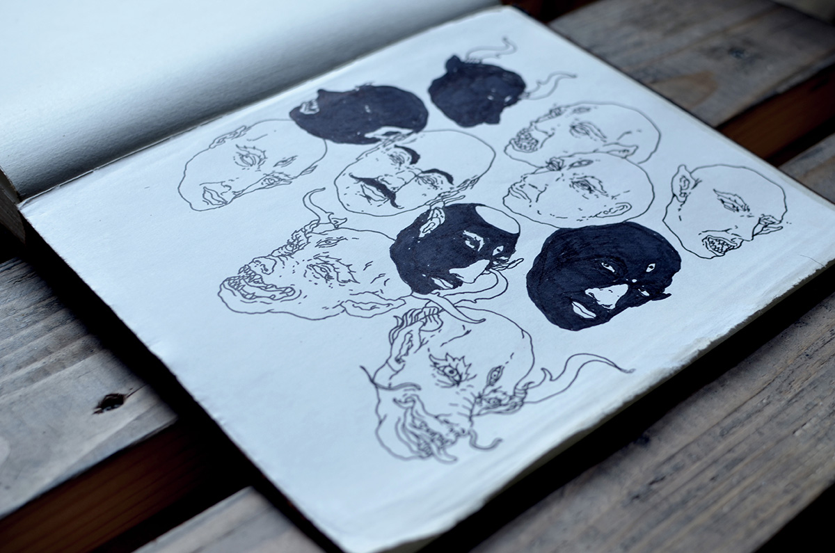
I also decided to include some of the more unrefined, rough and experimental drawings produced for this task. This is so as to demonstrate the difference in attitude and approach to this task that the previous one. Mainly that I cared less about how good an image looked but instead focussed properly on how media, process and how you as an individual see and choose to describe an image effects your outcomes and ultimately leads to the creation of more successful images. 


Sketchbooks: Development

During the studio session on sketchbooks we were also given the brief to begin a visual investigation into a given theme.
Out of those that we were offered and chose tropical rainforests and indigenous tribes. This was due to the wide range of challenging subjects it would offer such as human form, animals, wildlife and vegetation. Furthermore I already have an interest within the subject area and would like to expand upon my knowledge and understanding of it it visually.

Although I produced a lot of work for the brief, which only required 4 pages of work in one week, I was not happy with much of what I produced. This was due to, despite what was said in the presentation, being to concerned with trying to make good drawings. This ironically led me to make what I feel is some of my worst work due to being to restrictive and unadventurous with my drawing both in application and media use. 

For example here the choice of pencil combined with getting too locked into an image and trying to reproduce it on paper as led to the creation of stagnant and uninteresting drawings.


In particular I feel over embellishment and the clumsy application of graphite within this last drawing has made it both unpleasant and hard to read visually.


I feel my drawings have been more successful when a translation rather than simply reproduction has been evident. This was achieved through variation of marks and lines to describe form as well as not worrying about whether a drawing looks exactly life a photograph. Further more repeating the process of drawing an image in this case both broadened my understanding of the subject but also helped to my understanding of interpretation through drawing can alter and in some cases further an image. This is because you are free to alter form, composition, lighting etc. in a ways that isn't possible just through photographing a subject. 


With all this in mind I will make sure to worry less, experiment more both with media and application and in general be more free within my sketch books so as to hopefully create more varied and interesting work. 


Sketchbooks: Presentation/Lecture

In our visual language studio sessions we were briefed on the importance of keeping a sketchbook as a place to develop ideas and images. These are the fundamentals of what it means to be an illustrator and therefore if we want to achieve our goals, whether they be academic, personal or professional, we must develop a deep and meaningful relation ship with our sketchbooks.

Sketchbooks should therefore be a place to:

-Draw: from life, reference, imagination - even if it is bad.
-Repeat: the only way to get better and gain a greater knowledge into a process or subject is to keep repeating and trying until it works.
-Take risks: they are for personal development and therefore you shouldn't worry about making bad images with them but instead focus on pushing and challenging your current processes and of thinking through experimentation.
-Express and explore your personality and who you are as an image maker: should be free/unrestricted to be stupid, serious, be curious and ultimately explore and develop what interests and challenges you.

It was also important to stress that we shouldn't stress too much about the appearance of our sketchbooks or make it into an academic document. Therefore censorship, being overly decorative or tentative and attempting to make 'illustrations' rather than drawings should all be avoided.

James Jean is a good example of how a sketchbook should be used to both explore and develop your understanding of subjects and there form as well as explore and play with new processes and media. Furthermore, given the meticulousness and refinement present in his finished images it also demonstrates the freedom one should have within there sketchbooks. 


Although neither the best examples of either image makers or illustrators, I thought the sketchbooks of the various members of the Broken Figures graphic arts collective were an effective example of what a good sketchbook should be like. They are not afraid to play and make both personal and bad drawings within there sketchbooks. Further more they both draw and photograph images obsessively that serve to both document and reflect upon there nomadic lifestyle.


19NY AUG S22NY AUG S
_DSC0099 copy
_DSC0122 copy

This obsessive approach to sketchbooks and drawing is also reflected in the work of Jonathan Edwards but in a much looser approach shower the range of different voices individuals have within there own sketchbooks showing that there is no right or wrong. 

Tuesday 20 October 2015

Study Task 1: A-Z Typology Poster

Initial Ideas

-At first it seemed easy to respond to the brief having come up with over ten potential ideas for lists within the first studio session.
-However once I began to actually flesh out and develop the lists it became more difficult.
-This is mainly due to the difficulty in producing an idea that fits the brief as well as being both visually and conceptually engaging to a viewer.
-For example one of my ideas was to produce an A-Z of rappers. Although this may appeal to some people, the idea it self felt very conceptually stagnant due to its lack of depth.
-Visually I tried to solve this problem by adding a level of depth through including personal opinion and knowledge of the subject. This came in the from a trialling a top trumps type presentation of the rappers listing various statistics for each one.
-Ultimately I felt it was still too boring as I concept so decided not to proceed further with it.


-However, there were other ideas I had which were much more engaging and inventive but decided not to go with due to the difficulty in visually communicating and presenting them within one A2 poster.
-For example my list of reasons for being late. The idea being to have more realistic reasons at the begging and have them progressively getting more and more absurd as the poster went on.
-The reason I liked this concept was due to it being relate ability/mundane in the first half juxtaposed against the absurdity of the second half.
-Although many of the ideas produced for this list would have worked as stand alone images, I decided not to further pursue this list due to a lack of consistency between the images that I felt wouldn't work on the given format.
-However in hindsight I realise, had I produced more images and roughs for the idea I may have been able to reach a solution visually.


-In general had I not followed certain restrictions that I had unconsciously imposed on my self, such as the need for each potential list I drew out to have a idea for each and every letter and instead just drew out more and more sketches/ideas I would have produced more interesting and engaging work.
-Part of this I feel was due to my own hang ups about whether or not an idea/or drawing is good enough. This is something I really need to shake off as soon as possible as I feel it will soon begin to seriously impede my creativity and progress on the course.

Development of Chosen Idea

-In the end I decided to produce a list based on people/archetypes you would run into on a night out.
-Although still not overly deep I chose it due to the amount of playfulness it allowed for both conceptually and visually.
-Furthermore it allowed me to draw from my own experiences to produce something I thought would be engaging with a wider audience, particularly people of my age group.
-When during out the characters I tried to be as imaginative and play full as possible with each character.


-Where I wasn't happy with either the initial idea behind a character or simply the aesthetics of it I drew it out again.
-I felt this would create something more engaging conceptually as well visually create more movement within the piece.
-With my colour choice I decided to use a cold/deep blue. This is due to the fact that are often used when illustrating scenes set after dark.
-I tested the colour scheme out by redrawing characters in blue ink. The reason for choosing ink was its versatility as a media such as the ability to create different tones through the application of water as well as the variety of different marks you can make due to different pressure, dryness, brush type.


Final Outcome


-For the final out come I chose to display the vignettes in a composition lacking in uniformity. 
-This was initially due to the difficulty in placing all the characters next to each other in an even fashion due to there varying sizes/shape.
-However the tension this created within the poster I felt mirrored the chaotic nature of a night out/town after dark thus reinforcing my concept.
-In hindsight though producing more than one poster may have served to further enhance my final composition.

-Conceptually I felt my poster had some strength
-This was mainly achieved through its humorous critique of modern club culture. Much of which I felt was self depreciative as, although I wouldn't want to admit it I am sure I have been several of the characters depicting within the poster. This is a sentiment I am sure would be shared by many which I feel gives the poster further strength in the eyes of the viewer.
-However I still felt it lacked the depth and playfulness of other poster produced for the brief. When tackling future briefs I will try and resolve this by both creating more initial ideas, backed up with research, drawing and writing, as well the creation of more roughs/ways of visualising my final images/ideas. 

-My poster was reasonably well crafted with quality of line as well as use of tone/colour being parts I was particularly pleased with.
-However I feel the media a used/the way in which I applied it was a rather safe option. 
-Had I applied ink in a different way, such as being more gestural/creating more experimental textures,  or used different media such as paper cut or lino I feel I could have produced a more exciting and interesting final piece. This is something I will bear in mind when tackling the next brief.

-


Tuesday 6 October 2015

Brush and Ink Drawings

Ink and Repetition

-The use of ink helps imbue both confidence and purpose in mark making.
-This is because it forces you to take risks with, as well as think about where you place your lines/marks due to the inability to erase.
-The process was difficult to adjust to at first but as with previous sessions of observational drawing the more you do the more your confidence increases.
-Another useful lesson learnt was therefore to repeat the process of drawing out the same image over and over again.
-This is so as to further increase your understanding of its form through what you see and therefore be able to translate what you see onto paper in a much more successful way.


Drawing from Reference

-Whilst similar to observational drawing there several main differences I found with he process of drawing from reference.
-Firstly the images are static. This makes the process easier in some ways as it is easier to see the detail and begun to understand the form of would be moving forms such as the human figure. 
-This is a double edged sword in that it also means you can't take a closer look/view the object/form from other angles or within other movements.
-In other words you are restricted by the quality and composition of the photograph.
-However the fact that you can view and draw images that you can't necessarily experience from observation makes it of major importance. For example the images I chose of a woman half submerged in what appears to be the middle of the ocean.
-This is because it means when responding to brief that require you to draw a more adventurous subject matter you still have away of researching and understanding its form.


Drawing from Observation

-As previously mentioned the ability to view an object in physical space helped to understand and translate it on to paper.
-Observing and drawing plants was particularly useful in helping build up confidence with ink, line work and general mark making.
-The flowing organic form of roots/leaves/stems/etc forced you to try and translate this on to paper strong, gestural lines that followed and described the shape of the plants.
-Through repetition of drawing this helped created a better understanding and quality of line which can be transferred to the process of drawing any object/figure/form. 
-As with previous experiences with observational drawing I soon found myself locked into the process with each completed drawing making me want to complete another so as to further my progression.
-I feel this is mainly due to the difficulty/challenge drawing from observation and reference pose which in turn leads to the unending pursuit of creating drawings I feel personally satisfied with.


(apologies for poor photographs of bottom images, will re photograph when in studio)


Sunday 4 October 2015

Observational Drawing
-At first the process of observational drawing was a challenge due to how out of practice I had been recently.
-However as the first day progressed I found myself  getting more and more confident with each image I produced. This was evident in both quality of line/mark making, proportions and composition.
-In particular I felt that the bellow image of Matt Mercer was my first real break through, having caught some of the key features/characteristics of his face with minimal use of line.
-By the second day I felt much more confident with my drawing ability and after a brief warm up was much happier with the images I had produced than those completed earlier in the week. 
-his was mainly due to to the use of a more solid, graphic style with strong use of bold line work as opposed to more sketchy lines which I feel much more comfortable using. 
-Furthermore during the second day of drawing I found myself getting lost in the process of image making which made the process more enjoyable and led to much more successful results. 
-I feel this was due to the warm up experienced earlier in the week as well as, in my opinion, much more interesting subject matter.


-However despite this the process of observational drawing still feels like an ongoing battle to understand and translate what is in front of you which requires your full attention. After both days I still felt the need to draw more from life so as to further develop my observational skills. The improvement in my images after just two days highlighted just how much further I have to go and that regular observational drawing is the only way to achieve this.