Tuesday 16 February 2016


I See Faces: Initial Thoughts

The first thing that struck me with this module was the fact that, despite being brief driven, there seems to be scope for a high level of freedom and autonomy in how we choose to answer them. I particularly interested in how, due to not having to get bogged down in conceptual thinking which I think at times confused my last project, we have the opportunity to expand and develop our own visual language and aesthetic.
With this in mind I am really excited to start this brief as it will allow me to exhaustively explore the idea of 'character' within my work something that I have a strong interest in but, up to this point don't think I've explored in enough depth.

What makes a good character?

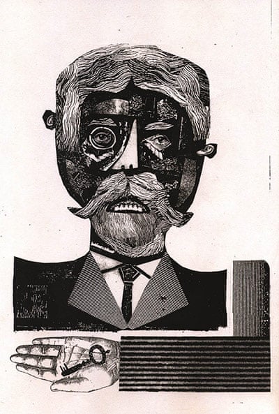
When considering character the first thing that struck me was how , although there is no right or wrong way of tackling it, simpler character seem to have much more of an impact. This is due to how, in Scott Mcloud's words, when you abstract an image by cartoon you focus in on specific details which allows you to amplify the meaning of an image in a way that more realistic images can't as is the case with the often highly philosophical work of James Jarvis where by he uses incredibly simply characters and images to convey highly complex ideas. This also allows us to question exactly we need/don't need to include to represent a face or figure as is demonstrated in the work on faces by Bruno Munari.


Bruno Munari                                                                  James Javis

In trying to answer this brief I will also have to bear in mind the importance of charm and personality and how powerful this can be in speaking to a viewer. Eleni's work is a perfect example of this as I feel there is a certain level of both innocence and anxiousness in much of her character that is very immediate and enduring.


Eleni Kalorkoti

Most importantly though is my need to consider what sort of imagery and characters I myself want to make. As mentioned before the lack of emphasis this brief puts on concept will allow me to be a lot more free and question what I want achieve through the use of character. I definitely want to focus on trying to make weird/far out characters and at times ones of a darker nature.
With this in mind the work of both Cleon Peterson and Michael Deforge resonates strongly with what I want to achieve. Peterson's work is very dark, depicting scenes of violence, greed and corruption. However it is his bold simple use of character that I am drawn to and that, despite this lack of detail, there is an incredibly high amount of movement and energy within his work.
Deforge's work on the other hand is a lot more whimsical and just plain bonkers at time. He has a vast array of characters all of which seem to have bizarre back stories that reflect their strange appearances.
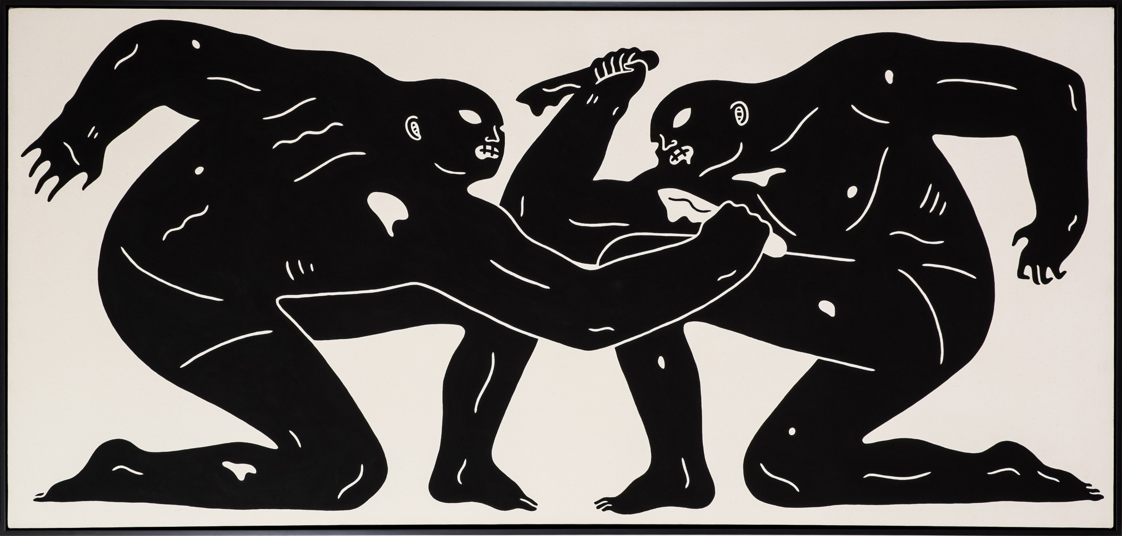


Cleon Peterson


Michael Deforge


Sunday 14 February 2016

Composition Task 


I drew out various different composition depicting and figure and a stone column within a coastal scene. The use of two distinct vertical elements within a sparse environment I felt would help me to successfully play around with different compositions. 
I chose the second rough for my final image as I though that the line of sight from the man combined with that of the curving land mass would draw the viewers focus to the column in the top right corner despite its small size. The choice of red for the column in contrast to the rest of the picture was meant to further exaggerate this.


However in the end I don't thing this composition is massively successful. This is due to the lack of depth present within. Despite including a for, mid and background, the image looks completely flat which is due to both media choice and the way in which I have drawn the individual elements. Had I varied the tonal value more this probably would have been avoided.

I n hindsight I think the 7th image depicting a figure within the water was probably the best composition and the one I should have gone with. This is because the for, mid and back ground are much clearer giving it a greater sense of depth. Furthermore the composition itself has much more harmony with the column taking much more focus due to both the line of sight of the figure and its size.
Studio Breif 2: What Is Image Making?
Composition

Composition is one of the fundamental skills involved in the process of making in images. It involves the layout of visual elements within a frame to create a harmonious whole that communicates the intent of the making.
Good composition should successfully draw focus to the idea(s) which you are trying to communicate through the layout of the various elements within.

4 Main elements to consider with composition:

Depth (fore, mid and background)
Line (line of site, directional lines within the image)
Value (varying values of tone)
Picture Area (frame, dimensions)


Robert Heindel

A harmonious composition is achieved in the above image by using symmetry through the placement of a central figure as well as splitting the various elements such as the car, distant hills/village and central figure within negative space roughly into thirds.
Furthermore the line of direction used (both figures looking off towards the distant hills) helps convey a sombre sense of longing (for the distant village in the distance) or the figure in the car depending on which why you look at it.


Eleni Kalorkoti

A sense of intrigue is create in the above image through the majority of the image being comprised of black negative space which is then dramatically broken up by the pair of scissors that take the viewers focus. This is achieved the stark contrast in values of the scissors and the hair, coupled with the pair of eyes looking towards the scissors. I really like how unconventional this image is in showing a 'some one having a hair cut' and goes to show that good composition doesn't always have to follow all the rules ( ie here there is no real sense of depth). 


Tomer Hanuka

Despite the complexity of the above image it is easily readable due to the clever use of lines of direction with in the composition. Almost all the elements, ranging from the text, police officers and layout of the subway direct your eye to the top left hand corner of the image at the fleeing member of the warriors. This simultaneously creates an image that is readable and direct in communicating the idea behind it ( ie a dramatic sense of movement present within the chase).

This exercise has opened my eyes a lot to some of the main principles of composition and in essence image making. Although it is something that I was aware of before and did consider to some extent I'd never analysed the composition of other's work as exhaustively as during this exercise. It is definitely something I am going to keep applying to the work of other's and in turn my own as, in past tasks composition has let me down as, although I've usually considered the aesthetic aspects of it I have often overlooked how it's main purpose is draw attention to the central ideas of an image.
3-D Craft and Lens

This has been by far my weakest submission for the entire visual language module. 3-D craft is one of the aspects of design that I struggle with the most so naturally I panicked a bit for this task and pushed it to the back of my mind until the last minute. This resulted in a very poor final out come. Although the costume it self was not awfully made, the whole chicken boy concept is very different to the work I would usually make and was to an extent a cop out. This was because I knew, due to leaving it until last minute the final photo would look pretty awful so I went for some thing funny rather than investing time in planning in some thing that would have been effective and representative of my own visual language.

In hind sight I should have just tried to craft some thing much simpler to a much higher quality and then planned out the final photo much better. This is due to the fact that the task was about the importance of art direction ( of which there is next none in my final image ) particularly in regards to how location, object and context work together to make a strong final image that concisely conveys a given idea or concept in a way that is much more immediate and universal than more traditional forms of illustration. The below images are a good example of this and how had I just done a simple well thought and and crafted response to the task I could have produced some thing to a similar affect. 


Rita Ikonen


Sarah Illenberger


Displaying Chicken Boy 4.jpg
Displaying Chicken Boy 2.jpg
Collage and Ephemera

Centred around the idea of re-appropriating pre-existing images, collage can be used to subvert and alter found imagery to serve your own purpose and method. This is often results in a lo fi aesthetic which simultaneously gives your work a authentic and anarchic feel.
Much like the previous session on shape, layout is key to working with collage and found ephemera as without it creating harmony between the various elements would be highly difficult. Therefore it could be argued it sits closer to design, something which I need to start considering more with regards to my own process of image making.


Anthony Zoros

The above by Anothony Zoros shows how, when layout, in this case mainly the relative size of the various elements, is carefully considered complex illusions, such as that of a vast expanse of space can be created through collage. This is particularly effective within this pieces due to element of craft present through the rip of the paper which shows the viewer how small the image is despite the illusion that has been created.


Ben Jones

I really like how Ben Jones combines found imagery with elements he has created himself to produce work that is reminiscent of pre-existing Victorian era imagery but with his own unique voice. Also it goes to show the importance of texture as well as the quality of found imagery in helping to communicate a certain tone or feeling within an image. Ben manages to employ this incredibly well through out his work to create dark images that are full of tension and uncertainty.


I tried several approaches to created collage based posters. The first method was purely analogue where by I worked with photocopied images and hand drawn text. I like the raw, gritty textures that were a result of blowing up found photographs too a much larger size on the photocopier, this I felt complimented the sound of the group in question on the poster. To some extent I think the layout works, mainly the use of three distinct segments, light greys at top, negative space in the middle and darker tones at the bottom. However the hand drawn text is really poor and although I was going for quite an anarchic look with it I think it has ended up looking messy and confused.

Next I tried creating one using digital methods. The main benefits of this is the level of control it gives you over layout and text as you can keep moving things about without having to commit to a fixed placement. However, although I was still working with scanned in found images, I felt that some of the rawness of the collage process is lost when working digitally.

With this In mind I decided to create a third poster using a mixture of the two methods discussed above. This resulted in an image more harmonious than the first due to methodical/systematic use of text but at the same time something more raw and engaging that the second image due to the use of analogue elements such as dragged paint, ink and found images.


Thursday 11 February 2016

Shape and Texture

As the course has progressed a have naturally gravitated towards work in which texture plays an integral part. I found this visual language particularly insightful as it allowed me to take a step back and consider exactly why we choose to use texture within our work and what value it can give work when applied successfully.

The main points I came to were as follows:

- Adds a certain level of authenticity to your work as it gives evidence of your hand as a maker.
- When using analogue media it gives your work a more visceral quality.
- This can be used to reinforce information you are trying to communicate through you work, particularly emotions/sensations/feelings
 -Is of particular importance within shape driven work as it can soften harder forms leading to a more harmonious composition that will feel more human and less clinical.
-Help describe light and tone within a piece, given my tendency to steer clear of more traditional ways of describing tone I feel this last point is one of the main reasons I gravitate towards texture driven work. It has consistently allowed me to break down elements within my work with out have to resort to highly rendered imagery something that I don't have a strong affinity or skill for.

strange fruitguardian weekend 02

Iro Tsalavala


Scott Bakal

Both Iro Tsalavala and Scott Bakal manage to employ texture effectively so as to produce highly emotive work that has a real human quality to it. They also predominantly work with flat shapes/imagery but manage to create a level of depth and intrigue through the use of texture. Depth has been/still is an issue within my work and texture could be an effective way of addressing this within my own practice. 
Finally what I love most about these two artists is the moody and ephemeral nature that is consistent through out there work. This is something I try to create within my work as It is often central to the themes/issues I try and tackle through image making.


I was reasonably happy with the two portraits that I created. Naturally texture helped reinforce to reinforce the moody and introspective feeling that often goes hand in hand with self portraiture. I really like the use of block printing ink due to the chaotic textures that it creates that can be easily manipulated to create different tonal variations ( ie the less ink the more faded/light the textures will be.


Given my issues with depth I also decided to create a large scale image consisting of a fore mid and background. Although I liked the initial layout/composition of the image I should have used media experimentation when roughing as in the final image certain elements have been confused ( ie the sky, floor and for figure ) due to over lapping of similar/same tonal variants.