Centred around the idea of re-appropriating pre-existing images, collage can be used to subvert and alter found imagery to serve your own purpose and method. This is often results in a lo fi aesthetic which simultaneously gives your work a authentic and anarchic feel.
Much like the previous session on shape, layout is key to working with collage and found ephemera as without it creating harmony between the various elements would be highly difficult. Therefore it could be argued it sits closer to design, something which I need to start considering more with regards to my own process of image making.
Anthony Zoros
The above by Anothony Zoros shows how, when layout, in this case mainly the relative size of the various elements, is carefully considered complex illusions, such as that of a vast expanse of space can be created through collage. This is particularly effective within this pieces due to element of craft present through the rip of the paper which shows the viewer how small the image is despite the illusion that has been created.


Ben Jones
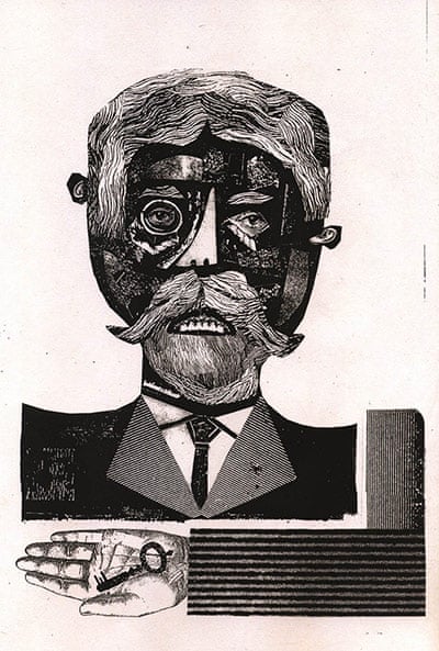
I really like how Ben Jones combines found imagery with elements he has created himself to produce work that is reminiscent of pre-existing Victorian era imagery but with his own unique voice. Also it goes to show the importance of texture as well as the quality of found imagery in helping to communicate a certain tone or feeling within an image. Ben manages to employ this incredibly well through out his work to create dark images that are full of tension and uncertainty.
I tried several approaches to created collage based posters. The first method was purely analogue where by I worked with photocopied images and hand drawn text. I like the raw, gritty textures that were a result of blowing up found photographs too a much larger size on the photocopier, this I felt complimented the sound of the group in question on the poster. To some extent I think the layout works, mainly the use of three distinct segments, light greys at top, negative space in the middle and darker tones at the bottom. However the hand drawn text is really poor and although I was going for quite an anarchic look with it I think it has ended up looking messy and confused.
Next I tried creating one using digital methods. The main benefits of this is the level of control it gives you over layout and text as you can keep moving things about without having to commit to a fixed placement. However, although I was still working with scanned in found images, I felt that some of the rawness of the collage process is lost when working digitally.
With this In mind I decided to create a third poster using a mixture of the two methods discussed above. This resulted in an image more harmonious than the first due to methodical/systematic use of text but at the same time something more raw and engaging that the second image due to the use of analogue elements such as dragged paint, ink and found images.


No comments:
Post a Comment