Thursday 21 April 2016


Leeds College of Art
BA (Hons) ILLUSTRATION
Level
04
OUIL406 Visual Communication
Credits
20
End of Module Self Evaluation

NAME
Christopher Cooper


1.  What have you learn about visual communication during this module and how effectively do you think you have applied these ideas?

The main point learnt about visual communication is that content is without doubt the most important aspect of successfully communicating ideas. By this I mean that, despite everyone being given the same briefs, it was all about researching and generating our own content which in turn could then be boiled down into a few key ideas and concepts which we would be attempting to convey through our work. This has highlighted to me that the process of both visual communication and well as the creative practice in general is something that should be individually driven to reflect your own desired intent.

In terms of actually communicating content the main point I repeatedly found myself coming back to, particularly when things weren't working, was that less is usually more when trying to convey meaning. Essentially if you can effectively reduce your images down to only the essential information that they need to say, the result will usually be something much more effective and concise it its deliverance of a message as well as giving it a much more memorable and dynamic aesthetic.


2. What approaches to/ methods of image making have you developed and how have they informed your concept development process?

This module has helped me develop a wide range of methods of image making through the various format requirements, ie gifs, vectors and images for print, that varied from brief to brief. Although I found it incredibly difficult and frustrating I think developing my skills with vectors was particularly useful given their importance in creating digital work within a professional design context.  
Furthermore the various different formats have forced me to adapt and later both my image making process and ideas development to their inherent restrictions so as to create work that is most appropriate to the given format. As state before this has often lead to a more reductive work process whereby I have tried to make my work say more with less.


3. What strengths can you identify in your work and how have/will you capitalise on these?

As with other modules I think my willingness to experiment, particularly in the first and third brief as resulted in a very varied and interesting body of work. However unlike in previous modules I think the main way I was able to capitalise on this experimentation was through taking a step back and refining my image making process into something that translated more effectively into a final outcome. This has been something of an issue both in this module and others, such as 404 and 405, and which I feel in the final brief: Persons of Note, I was able to effectively resolve.


4. What weaknesses can you identify in your work and how will you address these in the future?

A major issue was the lack of visual consistency in my first two briefs although it wasn't actually required for the first and I would argue that exploring different visual aesthetics and images making processes at the beginning of this module helped me expand my initial skill set. However with the second brief it was a major pitfall but one that I feel a addressed in my final brief. This resulted in a set of work that was much clearer in its conveyed meanings than that of the work produced for Greetings from.

In general I think my second brief had a lot of issues, particularly in terms of transferring rougher, hand developmental work into more refined digital outcomes. More roughing as well as digital development within Illustrator I feel would solve these issues in the future.


5. Identify five things that you will do differently next time and what do you expect to gain from doing these?

Rough more effectively in all my briefs. This will allow me to transfer developmental work in to final outcomes more effectively and concisely.

Explore more types of research, particularly primary. Although I was happy with the level of research conducted within this module I feel I could have generated more content and gained a greater in sight by carrying out primary research such as that which I conducted for Visual Narratives.

Explore different methods of printing my final out comes. I feel for the last brief my final out comes would have benefited greatly from being screen printed due to the subtle textures and inconsistencies the process gives your work.

Be more ambitious in what I would like to achieve with my final outcomes. This is not to say that I haven't done so during this module but rather that I feel like this module has helped me develop and refine a core set of approaches and techniques to visual communication in terms of image making, idea development  and working within a given format and that in the future I will be able to independently select and further push the required formats for a given brief.

Play with and bend the briefs more towards my own intent as a visual practitioner. Although I feel like I did this to some extent, much like the above point, I feel like now that I've established this core skill set and began establish where I want to be with regards to my own individual creative practice I will in future be able to better work with briefs to match my own intent which I think will in turn result it more successful, engaging and original responses to them.


6.How would you grade yourself on the following areas:
(please indicate using an ‘x’) 

5= excellent, 4 = very good, 3 = good, 2 = average, 1 = poor

1
2
3
4
5
Attendance


X


Punctuality


X

Motivation


X
Commitment


X

Quantity of work produced


X


Quality of work produced


X


Contribution to the group

X


The evaluation of your work is an important part of the assessment criteria and represents a percentage of the overall grade. It is essential that you give yourself enough time to complete your written evaluation fully and with appropriate depth and level of self-reflection. If you have any questions relating to the self-evaluation process speak to a member of staff as soon as possible.


Notes
Final Crit: Decision on Poster Design

The final crit proved highly useful in that it confirmed much of what I already though about my work as well as helped me finalise which poster design I would use.

The main points that were made were:

-The strong visual consistency achieved through a focus on composition and balance coupled with the recurring use of visual motifs conveying science/mathematics/astronomy. 

-This point I was particularly pleased with given the amount of time time and effort I have put in to achieving tonal and compositional balance as well as, given the pitfalls of last brief, creating a strong visual consistency within my images.

-That this also effectively communicated the intended themes of science/maths.

-Clear sense of loss and destruction communicated through the post cards and poster; seemed to be a running narrative perhaps depicting a life event.

-However although it was a agreed there was quite a serious and sad nature to the images, as expected the tragic aspect of my work wasn't quite as apparent as the more clinical elements relating to her teachings.

-On a more superficial level it was also generally agreed that they had a very professional feel to them that had been achieved through the high level of craft. 

-Again I was particularity happy with this point as it feels like something of a break through given that, in the past I have felt my weakest point has been the inability to make the transition from developmental to final work to the level of quality I desired.

-It was also generally agreed that the poster pictured below was the strongest outcome due to its strong minimal composition and sense of balance that give its conveyed meanings a certain level of pertinence and immediacy not present in the other design.

-After a discussion with Jamie on the ethics of using found imagery I decided that I would use this poster as my final submission given that I do still have a sense of authorship over it. This is due to the process of selecting and editing gone in to creating the image coupled with the fact that if using found issues was an issue many collage artists, such as previous big heads artists Kate Gibb, or art movements such as Dada-ism wouldn't exist.


For once I am actually pretty happy with my final set of out come. Aesthetically I think they each stand up on their own as well as working together in a strong, consistent set. Also despite all sharing a similar visual aesthetic I like how each set, the stamps, post cards, and poster displays various different skills such as use of drawn elements, found imagery, collage and vectors.

Finally in terms of developing my own practice, much like the end of Visual Narrative, I think this brief has resulted in something of a break through. This is due to the fact that I have answered the brief to an effective level given that I have created imagery that successfully conveys the intended meaning of my project whilst also creating the the time of imagery that I wanted to make. This is mainly work that is bold, minimal and graphic in its nature.
Digital Development: Post cards and Stamps

The process of creating the digital out come for my posters and stamps was a lot simpler than that of the posters.


I think this is in part due to the fact that there size allowed me to exhaustively rough designs to a more effective and quicker level. Furthermore much of the digital development and experimentation had already been done through the creation of the various different posters I created so that, by the time I got to creating these images my process had been refined and what I wanted to create visually had been better realised.

For example by this point I have a clear idea of how I want to achieve a level of visual consistency through my work. This is mainly through the use of strong, black and white image that put an emphasis on balance (notan) through the careful selection of a few bold, graphic elements. The result hopefully will be a series of stripped back and minimal outcomes have a clear and concise visual aesthetic as well as conveyed meaning.


With this in mind I think my above images clearly fit this aesthetic and work well as part of a series along side the posters I have already made. Further more I think they effectively convey my original intent to have of having the post cards subtly convey a narrative of the destruction of culture and teaching within Alexandria. 

I think this is achieve through the simple use of broken/tumbling columns ans statues alongside segmented/fractured mathematical elements which also serve to give an added level of movement and energy to the pieces that further reflects this idea of destruction.

Although I think to some extent they convey a sense of tragedy, especially through the use of the broken statue as well as the cloud like textures create from scanned in brusho drawing, I think that, much like with the posters, it is not quite as overt as the mathematical or destructive elements. This is in part due to the complexity of the actual emotion which in its self is quite hard to convey.


In contrast to this, given that I had highlighted from the start that I want them to be a celebration of her life and teachings, the stamps were much more simple to create in terms of concept than both the posters and post cards.

After roughing various designs to scale I then went about drawing my favourite ones up on illustrator. Much like my previous designs this was mainly an exercise in composition and tonal balance whear by I added block areas of black along side areas of white and mid tones created through line work to effectively break up the compositions giving them an overwhelming sense of harmony. This is particularly true when they are seen viewed as set.
Digital Development

Being satisfied with the amount of sketchbook development I have done I decided to now take my roughs on screen. As stated before this was so as to give me more control and be able to further reduce elements of my images so as to create out comes that are as reductive and immediate as possible.

To begin this process I scanned in and played about with the levels of the various portraits, profiles and statues I had drawn earlier, These I then combined on screen with shapes made out of scanned in textures as well as mathematical elements such as grids which I created on illustrator. 


Given the bold graphic aesthetic I was going for I decided to further edit and break up the textured images by playing about with there levels and applying the half tone bit map filter to them. In some cases I made the radius very large, sometimes reaching 40 points so as to abstract them into basic patterns as much as possible.


These first two were created directly from one of my initial roughs due to how striking I thought it looked within my sketchbook. However one created on screen It didn't quite occupy the space as well or communicate my intentions as much as desired. This is because it feels far less considered in the choice and placement of the various elements within the composition. I tried to simplify vy editing the tonal values of the circle so as to break apart the image in terms of tonal value. However I still don't think it looks quite right.

I had similar problems with the below image in that everything seemed a bit too random and confused.I think this is further exaggerated by making the figure the same colour as the background which pushes it back and makes it completely lost next to the other bolder white elements. 

I also think it is interesting that, although there is more elements on show in the below image, it feels so much more empty than previous roughs that had comprised of only three parts; less is more! 


With the mistakes made on the above images I decided to be as simple and bold as possible with the bellow image. This involved inverting the face to make it black on white as well as using striped and textured finishes on the other elements so that would be easily distinguished from the face. The result is a much more harmonious and balanced composition which I feel conveys strongly the events of her death in away that is tasteful and subtly refers to the erosion of scientific teachings that it became a symbol for.


Given what was discussed in my tutorial I decided to also play about with found images. I had originally tried to find the appropriate images in the library however after spending several hours that resulted in no appropriate images being found I decided I would have to start researching on line.

I soon discovered that the images I wanted, those depicting draped, female, Greek statues, were also known as kouros. After searching for a bit I came across a very in depth website detailing the various periods of Greek sculpture and the variations artists to which works could be credited to.


With this initial research done I then began searching for royalty free images of the sculptures discussed on the website.


These images I them began to play about with so as to make them more my own by cutting them up, altering and inverting levels as well as applying filters and textures to them. Although the first image is perhaps a bit too devoid of life and emotion the second, pictured about, I feel is probably the strongest post I have created.

This is due to its simplicity which makes it incredibly bold and immediate in delivery its intended themes. The grid and spherical form, created by warping a block printing ink texture and then cutting it out into a circle, simply and effectively communicate her teaching of mathematics and astronomy whilst the sight incline of the head combined with the expression of mourning on the statue convey the tragic sense of loss her death symbolised. 

Furthermore I think aesthetically it is the strongest in terms of composition. This is due to the balance of the individual elements which was created through the careful and precise placement of three distinctly different but simply elements: square, circle profile. The tonal balance, with the face containing the the darkest areas of black draws your eye immediately to it given its strong contrast with the white back ground.

My only issue with this image is the question of authorship given that one of the elements is from a found image.
Post Card Roughs

Whilst looking for practitioners to inform the more scientific aspects off my work I came across William Stein who creates simple geometric compositions vaguely referencing mathematical, scientific and philosophical concepts. Given the fact that I only have a limited understanding of these areas I feel a similar approach, if a little derivative, would be the best and most immediate way of communicating these themes. This seems especially pertinent given the fact that like me, the average viewer will also only have a basic understanding of the given themes.


William Stein

Although I have experimented earlier in this project with texture, I decided to pursue a much cleaner and graphic approach to creating geometric and mathematically informed images than the above work by Stein. This is because this clinical and controlled approach to image making is something I find highly challenging given that it is all about doing more with less. Furthermore I feel it best communicates my given themes and will have the greatest impact within the given formats.


As mentioned before I think I am going to use the post cards to create a subtle narrative hinting upon the destructing of a society/way of life and the end of an era. With this in mind out of all the above images the ones containing tumbling columns as well as angled and broken statues seem to jump out at me the most in terms of effectively trying to communicate this in intent. 

The next major step, as with my poster design will be to take things on screen so as to produce some much cleaner and minimal final out comes from these initial roughs.
Poster Roughs


Given the more free form nature of my previous sketchbook work I decided to tighten things up a bit moving on creating roughs within a frame created by scaling down the dimensions of the a2 posters. This allowed me, g to better channel the energy and ideas of my initial designs into something much closer to what my final images would look like.

Having looked at Glaser's work I began this series of roughs by creating various different clinical and graphic drawings based off of images of Hypatia as well as various Greek/Roman statues. Given the fact that there aren't any actual pictures of Hypatia, only artist impressions, I felt referencing statues was a much more effective way of creating the images I wanted.

 I then began de constructing.cutting these images up and placing them into various collages. This is a continuation of my earlier but executed in a much more precise and considered manner. I feel this is in part due to working within a set frame but mainly due to the much more careful consideration of composition and tonal balance. The latter factor has been highly informed by our work within visual language on the Japanese principle of Notan.


Although I like all of the above images I think in terms of communicating my intent the top right doesn't work. This is because it feels far too violent due its use of vary sharp angles and edges that create a very aggressive feeling within the work. Further more I feel the inclusion of eyes within the other compositions helps better convey this idea of tragedy and sadness due to the sense of mourning it gives the figures.

Compositionally I think the strongest is the top right due to the strong sense of tonal balance which was created intentional by placing the light face in a position that would dramatically contrast to the black of the top right and the mid tone create by the squared paper. The black pillar has been placed with similar consideration but inverse, ie dark on light.


Above are several larger, a2 and a3,  roughs that I created. Although I think they both communicate some of my intended themes and concepts, compositionally they don't feel as strong as the images created in my sketchbook.

I particularly don't like he a2 poster. Although it conveys astronomical themes, the a2 image feels fare to crowded and confused compositionally. The repeat images of Hypatia's silhouette are almost lost and seem more like sonar rays than human profiles which completely throws of the meaning of the image as well as making it aesthetically unappealing.

As Matt suggested I need to make sure I don't underestimate the power of incredibly simple but powerful image making. It is this approach that I think makes the first four images work on a much higher level given that all four are made up of only three major elements. 
Artists Research: How best to convey my intent?

Although as stated in previous posts, this brief isn't a simple exercise in portraiture, I realise that at least on of my final images will contain some figurative elements even it is just small fractions of Hypatia's face. 

Matt suggested I look at the work of Milton Glaser in how to approach figurative drawing as, although the ink drawings I had used in my collages looked quite striking, they were perhaps not sophisticated and graphic enough in there appearance to effectively fit the more sombre and technical themes I am exploring through this body of work.

I therefore proceeded to withdraw Milton Glaser: Drawing is Thinking, an absolutely fascinating book documenting hundreds of Glaser's drawings. He is an absolutely phenomenal draft man with various different approaches to drawing and visual aesthetics explored through out the book. However the drawings that struck me as being most relevant to my own practice were the much more stripped and rather cynical looking line drawings some of which are shown bellow.

Although obviously the mood in these isn't as sombre as what I am going for but the fine, highly controlled uniform line work combined solid blocks of colour could prove highly effective in creating the striking portraits needed for my collage work.


Milton Glaser

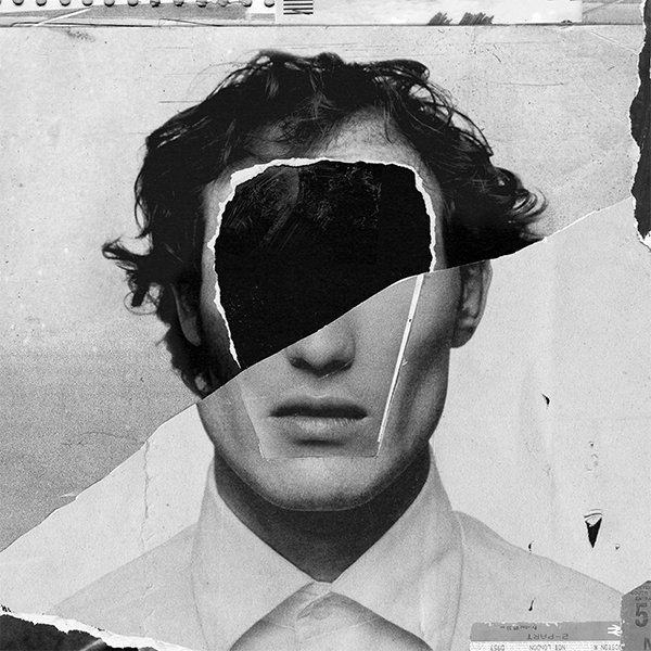
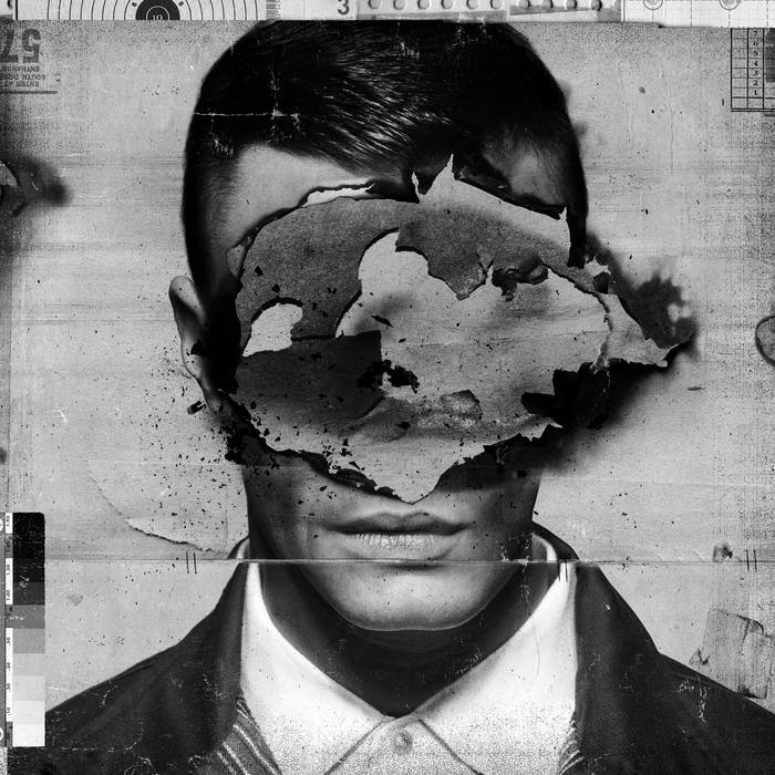
As well as Glaser's work I also happened across the dark, experimental collages of the provocatively titled Adult Art Club. I really like the tension created in these images through the use collaged and cut elements. It is particularly effective how they seem quite chaotic and random in how they've been put together but clearly a lot of consideration and precision has been used in choosing which areas are cut up, blocked out, removed etc. 

They also have a certain ambiguity to the them creating quite an eerie dehumanised feel to them, something we I could use within my own work given that, when talking about people so long ago in the past it is quite hard to directly relate to them on a human level due their historical significance which seems to put them on a level above normal human society.

However when exploring this sort of approach to image making I need to be careful not to create work that is too sinister or violent in its appearance given that the many themes I have highlighted to communicate are scientific/mathematical teachings as well as tragedy in terms of the events that befell Hypatia.

Phosphene cover art

Adult Art Club
Tutorial / Feedback From Matt

Highly informative and useful discussion with Matt in regards to my work on Hypatia. Took the right step in terms of changing person as well as being more experimental and free in my approach to image making. However it was suggested I needed to take a bit of a step back so as to fully realise precisely what my intent is in regards to the conveyed meanings of my work given the complex nature of my subject and the initial flurry of ideas I have had.

This resulted in deciding to use the different formats to focus on the different aspects of Hypatia's life. For example the poster and post cards could be used to convey the erosion of a culture as well as scientific, philosophical and mathematical teachings of which her death as become a symbol. This would involve trying to convey a feeling a tragedy through my work which I think will be highly difficult.

In contrast to this the stamps could be used to simply celebrate her life's teachings given that there size require much simpler and concise images.However for all my work, regardless of the size, Matt said that I shouldn't underestimate the power of incredibly simple imagery in effectively conveying my intent.

Process wise, although I had already planned on doing so, I was strongly encouraged to take my work on to the screen given the graphic nature of it as well as explore the use of found imagery within my collages. This was so as to give working process more control which hopefully will result in more concise and immediate outcomes.
Change in Direction: Further Research and Initial Visual response for Hypatia of Alexandria.

Having felt like I had hit a bit of a wall in generating ideas/responses to Quentin Crisp I decided to swap to another One of my persons of note: Hypatia of Alexandria. This was because I felt like there was more to say about her in terms of life achievements, philosophies/ethos as well as the tragic events that engulfed her.

In the same way that I approached the work to Crisp I think it is important to initial highlight the most important factors of my research. Firstly I think the fact that she is perhaps the only example in history where a woman has been the undisputed leader of the intellectual world, of which Alexandria was at the centre during the time she was alive, is highly remarkable and it is some one tragic that, when researching this there wasn't as much on her as other male philosophers/mathematicians that has come before her.


Therefore I began my visual investigation by producing a series of collages conveying motifs of mathematics, mainly algebra and geometry, as well as astronomy all of which she was highly knowledgeable of even by today's standards.

Initially I thought perhaps they might be a little to ham fisted in the deliverance of the themes/ideas, however given that it is a subject I am not expert in it is a decent starting point that with some refinement could lead to something both interesting and highly immediate/readable in terms of the inferred meaning. 


The other important part of her life I wished to portray was her death. This is because, as stated in my previous post, it has become symbolic of the end of the period of classic antiquity, an age strongly associated with logic and reason, and the start of the early Christian period which arguably threw the region into something of a dark age.

Therefore I began trying to experiment with images that inferred the destruction of a civilisation and its knowledge as well as ones subtly inferring her actual death.

For example in the above image I created various portraits of her then cut them in to various fragments which I combined with basic geometric forms, squared paper and other bits of paraphernalia pertaining to her status as a learned woman. Given that I'm not one for gore I felt this was a much more subtle and tasteful way of simply hinting upon this given the gruesome nature of her actual death hat involved stoning and flaying at the hands of an angry mob. 

I also began experimenting with other simple motifs such as columns and architecture that would help convey the period classical antiquity, particularly the areas of ancient Greece, Rome and Egypt which are associated with it.


I was keen to try much more experimental methods of image making due to the restrictions I felt I had faced within my sketchbook during the last brief. Furthermore I was particularity drawn to the potential of experimental collage due to my love of shape based imagery as well as what I thought would be an opportunity to expand upon previous visual ideas I had touched on in both Visual Language and Narratives. This is once again an example of how this module is slowly alowing us to direct our practices into something much more individual and driven than perhaps they were at the start of the year

Wednesday 20 April 2016

Further research and Initial visual response: Quentin Crisp

From my research the main points to take from Quentin Crisps life were his defiance of conformity and public expectations through his flamboyant, effeminate appearance and open homosexuality that often lead to confrontation and more often than not persecution. As this task isn't simply about creating portraits I decided to depict simply the most extreme parts of his appearance at the time. These include his long feminine hair that was dyed lavender as well as his polished and brightly painted nails.

The below images were created with brush and ink and I feel the top right is the most visually pleasing. This is because the others feel a little to graphic and clunky where as the top left has a nice free flowing aesthetic to it as well as tonal variation with give a much more recognisable impression of hair. The simplicity of the images I feel would translate well onto the post card or stamp format.

Although still at the very early stages of this brief I have already started to think how these may transfer into the final formats given the mistakes made/lessons learnt on the last brief.


I also experimented with further reducing the complexity of the hair into simple flowing brush strokes leaving areas of negative space to describe Crisp's hands and face as well as a simple black shape in the right hand image to give a subtle impression of his famed fedora. This  has resulted in more abstract and playful images which, to a certain extent reflect his personality particularly his wit and tendency to cause controversy through both his actions and remarks.

However, despite this I still don't think these images speak enough about his personality or ethos.

To try and solve this I produced several images employing a similar but more reduced aesthetic to the one above containing key quotes that I felt helped sum up his attitudes. 
These included:

'Fashion is what you adopt when you don't know who you are.'

and:

'To know all is not to forgive all... it is to despise everybody.'

Both of these showed, in my opinion, that despite his flamboyant appearance and out going social life he was in fact a man of many insecurities with a deep disdain for the wider world.

Visually I think they are a little too messy, particularly the type, however, as with the previous images they do have a certain playful flamboyance which I think reflects some aspects of Crisp. I also think the use of a simple but quite loud colour pallet both further reflects the conveyed themes as well as gives all the images a visual consistency. The latter point is something I am keen to nail in this brief given the problems of my last final out comes.


To further explore these themes that seem at the heart of his life's out look I experimented with visual motifs conveying duality. This was due to the the conflict and tension that seemed to exist between his outgoing nature and flamboyant/provocative appearance that seemed at complete odds with his ethos. This view seems to be back up by, despite being seen as a guy icon and defying public preconceptions in a very homophobic period of time, he himself made various homophobic remarks later in life which included denouncing the guy pride movement.

To try convey these ideas visually I played around with drawing simple recognisable portraits of Crisp looking relatively candid and easy going with more sinister projections of himself appearing out of the shadows and negative space. 

I think as an initial attempt its an ok concept, I think in the below images the execution is a little to clumsy particularly the duo head and basic portrait/shadow. The slightly more experimental ones, created with ink and brush as well as acrylic paint dragged through tapes off areas I think have some potential, especially due to the contrast between the simpler forms of the faces present and in the negative space and the more complex drawn ones.


In general I am struggling a bit for ideas with regards to this person of note. Initially I chose Crisp due to his flamboyant appearance which I felt, given the more graphic nature of my work on  previous submissions, would prove a challenge. However In comparison with the other two people I think there just isn't quite as much to say about him or an interesting enough angle to take in answering this brief.